The Tinderbox of Debt and Deficits
United States – Spendthrift Uncle Sam
The Wall Street Journal23 on September 12, 2013 proclaimed:
Budget deficit on track for smallest shortfall since 2008
The U.S. government is on track to lock in its lowest budget deficit since 2008, new Treasury Department data said Thursday, as the gap between spending and revenue continues to contract. The federal budget collected $185 billion in revenue last month, an August record, helping to push the 12-month deficit down to $680 billion. Still, the government spent $333 billion in August, logging a $148 billion deficit, or gap between spending and revenue. August was the eleventh month of the 2013 fiscal year, and the September data will likely show that 2013 was the first year since 2008 that the government had an annual deficit of less than $1 trillion.
Pre- and Post-1971 – From Fiscal Conservatism to Profligacy
 During the Great Depression, the deficit reached a peak of 6.6% of GDP, which is smaller than the post-2008 average deficits of over 8% of GDP for fiscal 2009-2013.
 During the Great Depression, the deficit reached a peak of 6.6% of GDP, which is smaller than the post-2008 average deficits of over 8% of GDP for fiscal 2009-2013.
The U.S. Government did not always run deficits. As detailed in “The U.S. Deficit/Debt Problem: A Longer-Run Perspective,”25 during the 19th century the U.S. generally ran budget surpluses, and it was only during wartime or financial crises that the Government spent more than it collected. This discipline continued into the early 20th century when the Government ran surpluses, except during the two world wars and the Great Depression. During the Great Depression, the deficit reached a peak of 6.6% of GDP, which is smaller than the post-2008 average deficits of over 8% of GDP for fiscal 2009-2013.26
From 1947-1970, the U.S. budget was generally balanced, and averaged a small deficit of -0.22% of GDP. However, from 1971-2012, both the frequency and the magnitude of fiscal deficits stand out. Over this 42-year period, the average U.S. budget deficit was -2.95% of GDP, more than 10 times the average for the previous 24 years.27 Thus, a marked change in U.S. deficits occurred after 1970, when President Nixon eliminated the gold standard in order to spend without restrictions.28 Nixon touted that looser monetary and fiscal management would stimulate growth, create jobs and improve U.S. exports.
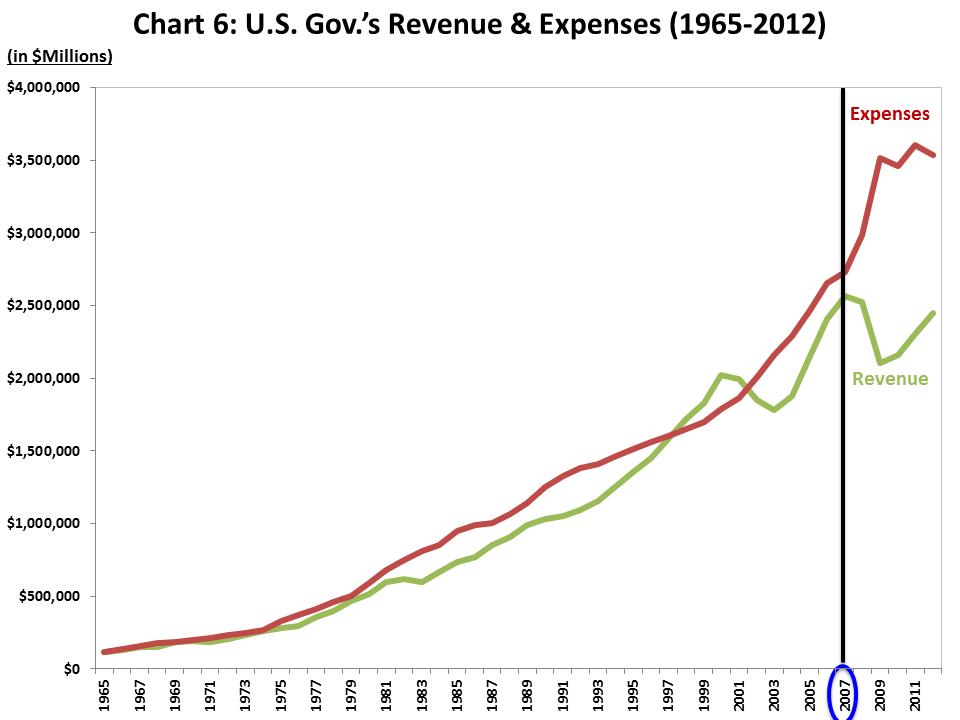
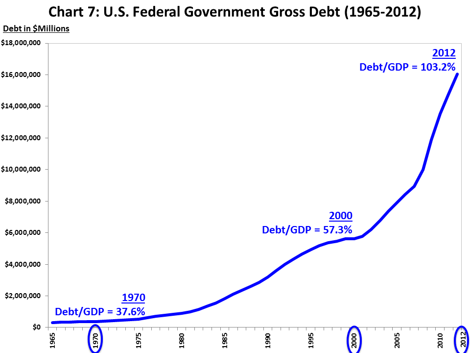
Chart 6 shows the gap between the U.S.’s Government revenue and expenses from 1965 to 2012, where annual deficits slowly became the norm, with the odd surplus appearing during a strong growth period. These deficits caused U.S. Government’s gross debt to skyrocket to around $17 trillion today29 (see Chart 7 below).
Chart 7 shows that after 1970 the Government’s gross debt grew much more quickly than previously. In 1970, U.S. debt/GDP was 37.6%, and it reached 57.3% in 2000, and then doubled by 2012 to 103.2%.30
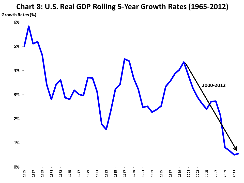
After 2008, the Government tried desperately to stimulate the economy and ran large budget deficits, while the Fed aggressively increased money printing through multiple QE programs to try and reignite economic growth. However, as highlighted in Chart 8, U.S. real GDP growth has continued to slow since the 1960s, with a significant drop in growth post 2000. Further, despite the current aggressive stimulus programs, growth remains especially weak for this stage of the economic cycle.
Numerous studies have concluded that high debt levels eventually become an impediment to economic growth.31 The most notable analysis, “This Time Is Different – Eight Centuries of Financial Folly” by Carmen M. Reinhart & Kenneth S. Rogoff,32 catalogues previous economic failures over eight centuries and 66 countries. Reinhart’s and Rogoff’s conclusion is that significant debt is an impediment to growth, yet as their book title mocks, the popular view is that this time it’s different.
Managing the Debt Going Forward
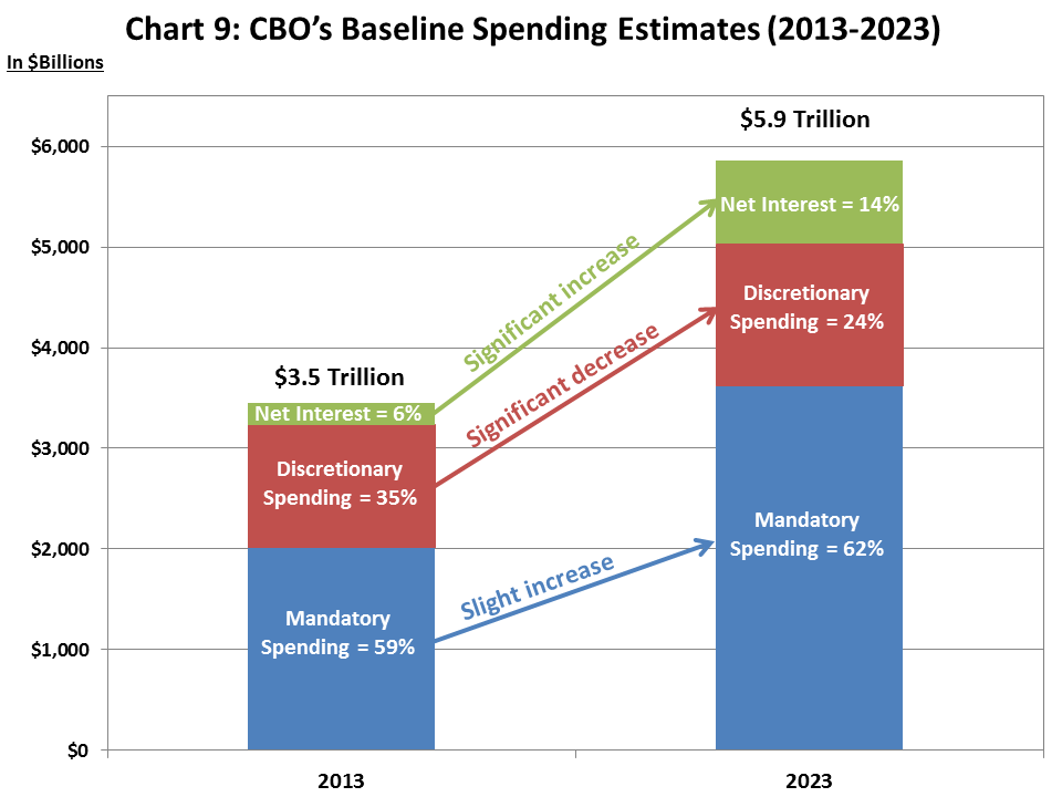
When assessing how the U.S. Government can manage its debt and deficits going forward, it’s helpful to understand its spending patterns. Over the past 20 years, Government spending grew 63% faster than inflation, and in May 2013, the U.S. Congressional Budget Office (CBO) projected annual Government spending will grow from $3.5 trillion in 2013 to $5.9 trillion by 2023, a 69% increase over the next 10 years, as shown in Chart 9.33
- Mandatory Spending = 59% of Total Spending in 2013: Around 80% of mandatory spending includes Social Security, Medicare and Medicaid (i.e., entitlements). Currently there are no budget limits on this spending, which is projected to increase to 62% of total spending by 2023.
- Discretionary Spending = 35% of Total Spending in 2013: This spending is part of the budget that Congress determines annually. It includes items like defense, education, agriculture, homeland security and transportation, and is projected to decrease significantly from 35% today to 24% of total spending by 2023.
- Net Interest = 6% of Total Spending in 2013: Debt service costs are projected to more than triple from $223 billion in 2013 (6% of spending) to $823 billion in 2023 (14% of spending), assuming today’s low rates increase only modestly.
 Forcing short-term interest rates to zero enabled weak companies to survive; hence the normal self-cleansing process was significantly diminished. The result – higher Government debt, weaker economic growth prospects and a more difficult operating environment for the surviving companies.
 Forcing short-term interest rates to zero enabled weak companies to survive; hence the normal self-cleansing process was significantly diminished. The result – higher Government debt, weaker economic growth prospects and a more difficult operating environment for the surviving companies.
Since debt service costs are a mandatory expense, the only way the U.S. Government can pay its increased debt service costs will be by reducing Discretionary Spending, leaving less money for defense, transportation, infrastructure, education, etc.
The CBO’s September 2013 report “The 2013 Long-Term Budget Outlook”35 highlights the harmful effects of the U.S.’s large and growing debt. The CBO states that at some point investors will start to doubt the Government’s willingness or ability to pay its debts, making it more difficult and expensive for the U.S. to borrow money. The CBO projects that the already high and increasing debt will have negative consequences for both the U.S. economy and the Government’s budget, as:
- Debt service costs will rise, thus necessitating tax increases and spending cuts;
- The Government will be constrained in its policy choices and responses to unexpected events, such as a recession or a war; and,
- The risk of a fiscal crisis will increase, where investors demand higher interest rates.
The U.S. capitalistic system flourished historically because of its flexibility. It enabled risk takers to earn great profits when they succeeded and let them go bankrupt when they were wrong. During the 2008 financial crisis, the Government initially intervened to avert a banking crisis that would have destroyed confidence in the system. But over time this “crisis support” morphed into a longer term plan to stimulate growth. Forcing short-term interest rates to zero enabled weak companies to survive; hence the normal self-cleansing process was significantly diminished. The result – higher Government debt, weaker economic growth prospects and a more difficult operating environment for the surviving companies. This is an example of the unintended consequences when a complex system is manipulated.
Whither the U.S. Equity Markets?
The U.S. equity market is currently the “cleanest dirty shirt” globally. Despite being at the epicentre of the 2008 financial crisis, experiencing slow economic growth, weakening corporate performance, mounting debt, a credit downgrade together with the challenges of a dysfunctional government, U.S. equities have out-performed International equities (including emerging markets) by approximately 45% since 2009.36
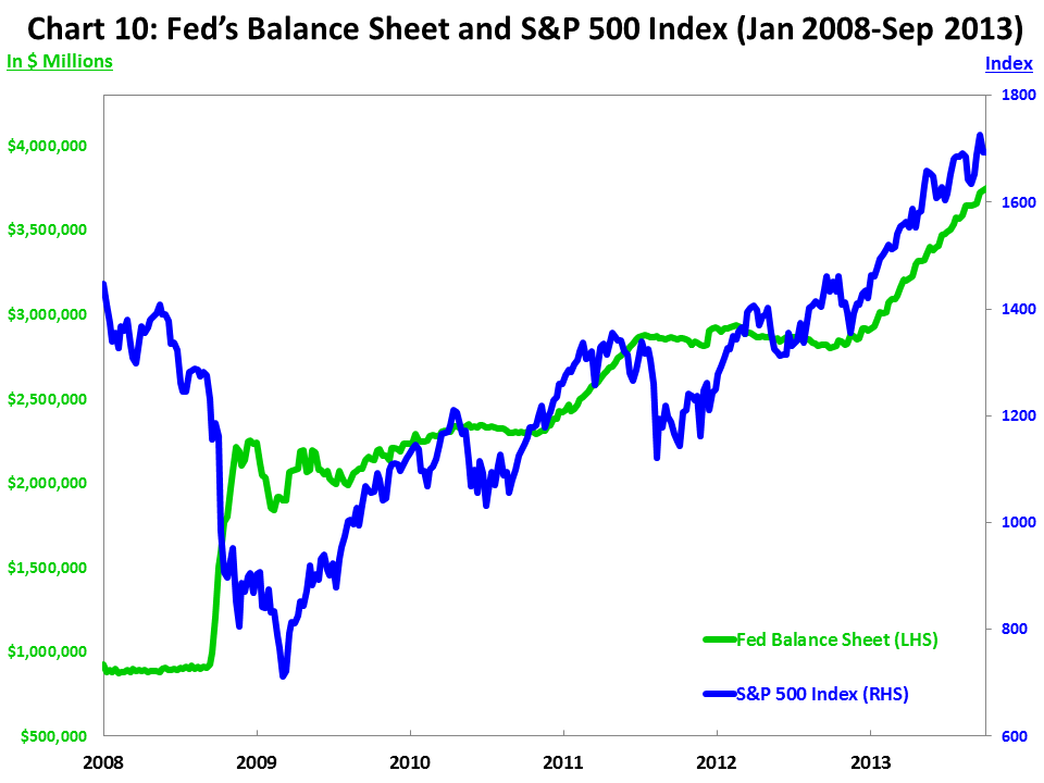
After the 2008 financial crisis, jittery investors became addicted to central bank money printing. As short-term interest rates approached zero in late 2008/early 2009, the major central banks pursued less conventional monetary policies, such as QE programs.37 The Fed’s focus with QE expanded from inflation targets to include employment targets and stimulating the real economy. The Fed implemented multiple QE programs, which helped buoy U.S. equities. As Chart 10 shows, as soon as U.S. equities started to decline, the Fed introduced a new QE program (evidenced by a growing Fed balance sheet), and each QE program propelled the S&P 500 Index upward until money printing slowed. The Fed flooded the market with liquidity and investors put this money to work in equities, pushing prices higher. However, the U.S. economy remains relatively weak, and corporate revenue and earnings are growing more slowly than is normal at this stage in the cycle.
Is the U.S. Following Japan’s Roadmap?
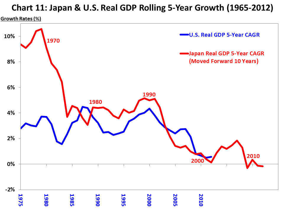
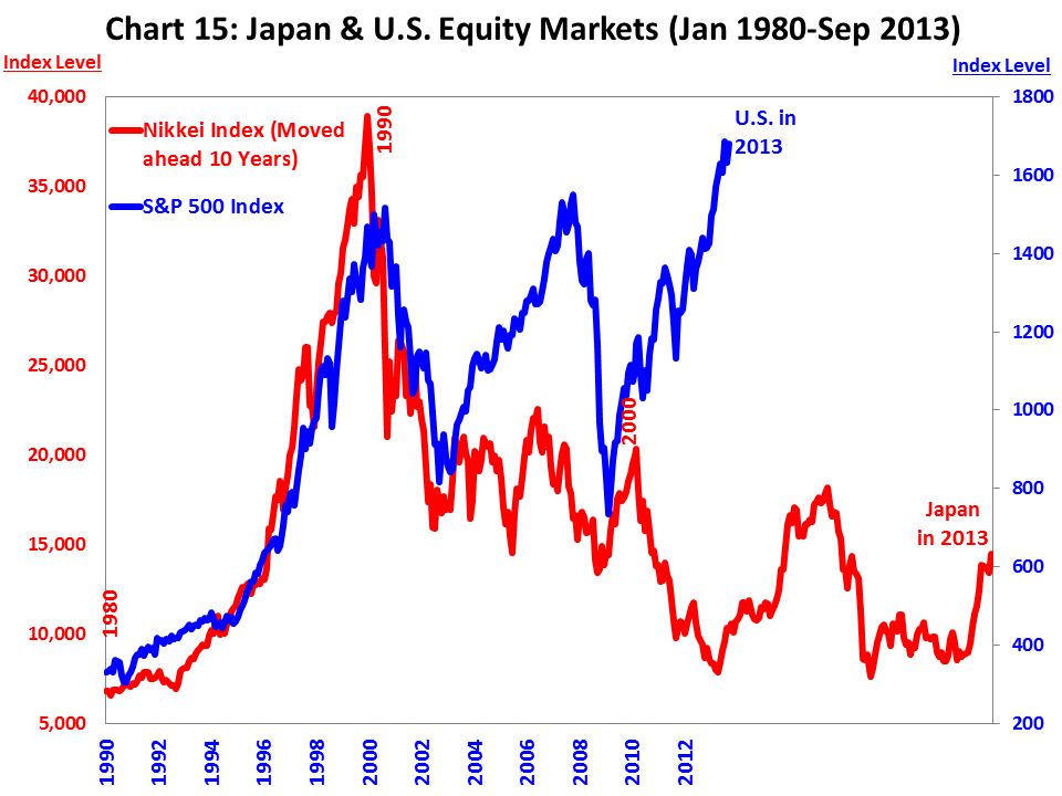
Note: Chart 11 overlays Japan’s growth line in red on top of the U.S.’s growth line in blue, but with a 10-year lag (i.e., the data in Chart 4 [Japan’s Real GDP Rolling 5-Year Growth Rates, 1965-2012] is overlaid 10 years ahead of the data in Chart 8 [U.S.’s Real GDP Rolling 5-Year Growth Rates, 1965-2012]). We have followed this 10-year lag for Charts 11, 12, 13 and 15 below.
 Japan’s long-term equity market decline reflects its lower GDP growth, deflationary trends and worries about increasing government debt – all of which are a concern in today’s U.S. economy.
 Japan’s long-term equity market decline reflects its lower GDP growth, deflationary trends and worries about increasing government debt – all of which are a concern in today’s U.S. economy.
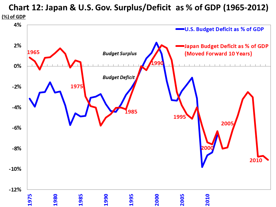
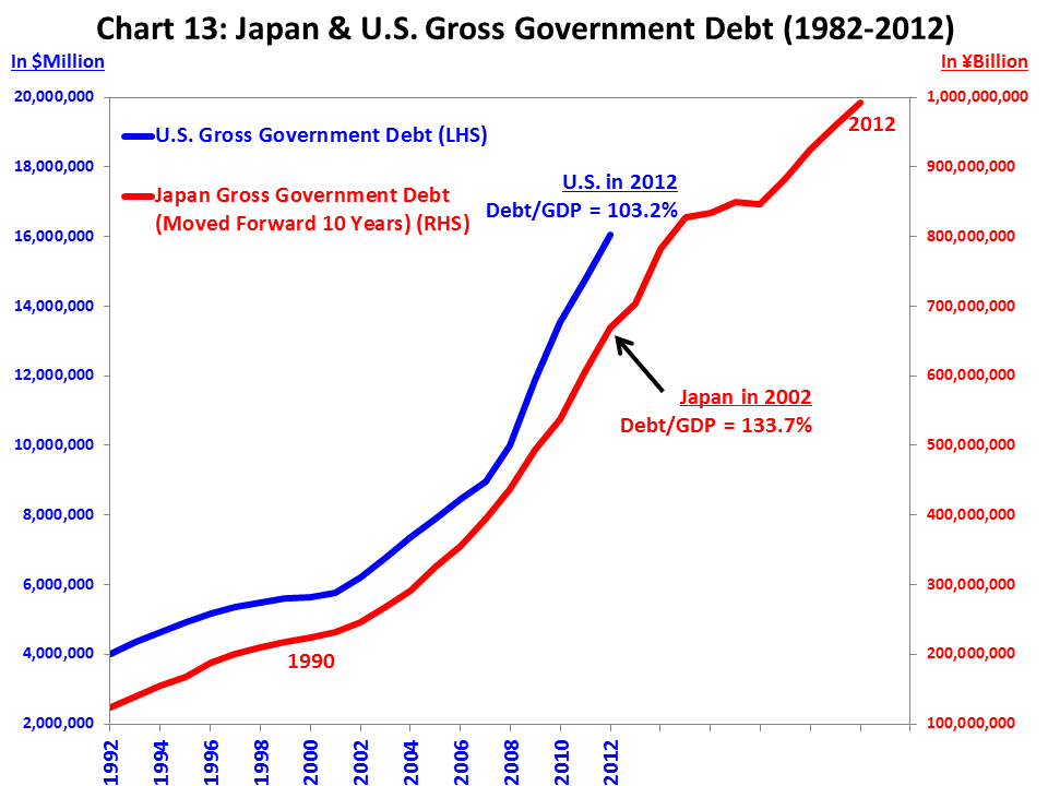
Similarly, when we assess Japan’s and the U.S.’s gross government debt and debt/GDP, we see similar patterns assuming the 10-year time lag, as highlighted in Charts 12 and 13. Chart 12 shows Japan government’s annual surplus/deficits as a % of its GDP in red from 1965 to 2012. Similarly, we show the U.S. government’s annual budget surplus/deficits as a % of GDP in blue from 1975 to 2012. The general pattern of increasing budget deficits as a % of GDP looks remarkably similar, albeit with a 10-year time lag.
As stated, it took just over 10 years for Japan government’s debt/GDP to double from around 100% in 2000 to 210% by 2012. As Chart 13 shows, the U.S. is following Japan with a 10-year lag, given that Japan’s government debt/GDP was 133.7% in 2002, while the U.S. breached 100% debt/GDP in 2012. Unless something dramatic changes, it appears likely that the U.S. will follow Japan’s dangerous path to a much higher debt/GDP ratio.
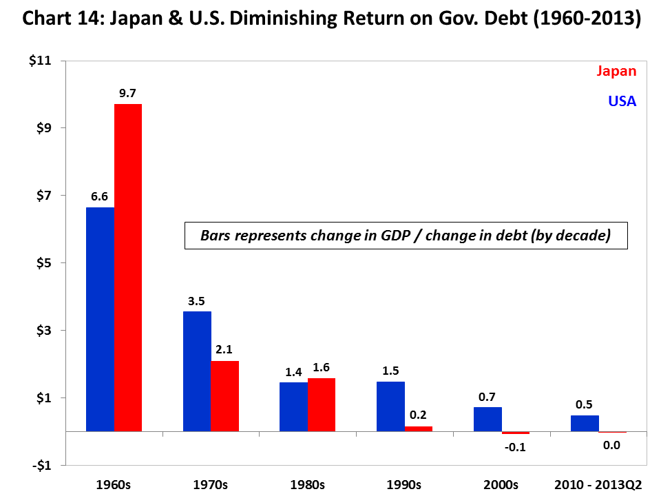
Economic growth has slowed in both Japan and the U.S., while government debt has significantly increased. We question the economic benefit for both countries of the increasing debt. Chart 14 shows that both Japan and the U.S. had a diminishing return on their “investment in debt.” (Note: The bars represent the change in economic activity [i.e., nominal GDP] per decade, divided by the change in government debt, which increased significantly each decade, especially since 2000). While Japan earned solid returns on its debt investment in the 1960s, this return fell in the 1970s, and since the 1990s the return averaged close to zero. Similarly, the U.S. earned a solid return on its debt in the 1960s-70s, but returns dropped in the 1980-1990s and continued to decline thereafter. Again, the U.S. appears to follow Japan’s path, as Japan continues to suffer from too much debt, insufficient growth and deflation.38
One key difference between Japan and the U.S. is their equity market performance. Since Japan’s stock market bubble burst in 1989 the Nikkei Index is down over 60% from its peak while the S&P 500 Index is hitting new highs as shown in Chart 15.
Note: In Chart 15 we overlay the Nikkei Index on the S&P 500 Index with a 10-year lag. Japan’s equities start in 1980 when the Nikkei was trading around 6,700 and ends in September 2013 around 14,500, and we overlay this with U.S. equities, which starts in 1990 when the S&P 500 was trading around 330 and ends in September 2013 at 1680, close to its all-time high.
Japan’s long-term equity market decline reflects its lower GDP growth, deflationary trends and worries about increasing government debt – all of which are a concern in today’s U.S. economy. However, U.S. equity markets continue rising as investors search to earn better returns than on bonds, and ignore key fundamental equity valuations. As history has shown, it’s likely that this valuation discrepancy will be remedied sooner rather than later.
Page:

